10.4 首页index
开始构建小程序首页。
第一步,我们需要创建顶部的导航栏,效果应该类似图10-2:
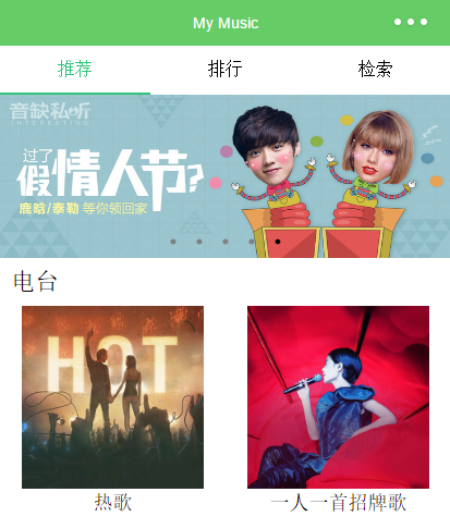 图10-2 首页推荐部分样图
可以看到这个导航栏由三个按键组成,三个按键平分屏幕宽度,文字居中显示,在选中后下方有绿色边框。
为了实现这一效果,这里采取一个比较简单的做法,为每个标签的每个状态(选中/未选中)创建一个view。
<view class="tab">
  <view class="tab-item tab-item-selected" bindtap="tabItemTap" data-view="1" wx:if="{{currentView==1}}">推荐</view>
  <view class="tab-item" data-view="1" bindtap="tabItemTap" wx:if="{{currentView!=1}}">推荐</view>
  <view class="tab-item tab-item-selected" bindtap="tabItemTap" data-view="2" wx:if="{{currentView==2}}">排行</view>
  <view class="tab-item" data-view="2" bindtap="tabItemTap" wx:if="{{currentView!=2}}">排行</view>
  <view class="tab-item tab-item-selected" bindtap="tabItemTap" data-view="3" wx:if="{{currentView==3}}">检索</view>
  <view class="tab-item" data-view="3" bindtap="tabItemTap" wx:if="{{currentView!=3}}">检索</view>
</view>
tab-item {
    float:left;
    width:33.333333%;
    height:86rpx;
    font-size:32rpx;
    text-align:center;
}
.tab-item-selected {
    color:#31c27c;
    border-bottom:4rpx solid #31c27c;
}
所有6个view都享有tab-item这个class的属性,在这里定义了组件的宽度为1/3,字体居中显示以及字号。三个布局拥有tab-item-selected属性,这个属性为这个view添加了底部的绿色边框。currentView为控制这一组件的值,当currentView=1时,根据wx:if属性,只有带下边框的“推荐”view与不带下边框的“排行”,“检索”会被渲染,也就实现了我们想要的结果。
在index.js里编写view的点击事件tabItemTap,这个名字跟我们在写wxml时bindtap一致。
//获取应用实例
var app = getApp()
Page({
    data: {
        currentView: 1,
    },
    onLoad: function () {
        var that = this;
    },
    tabItemTap: function (e) {
        var _dataSet = e.currentTarget.dataset;
        this.setData({
            currentView: _dataSet.view
        });
    },
})
每次点击后,获取点击view的data-view的值,然后将这个值赋值给currentView,从而更新界面。